


Green: A Colour Story
By Ruth Webber
May 26, 2021

Colour is central to everything we do at Bert & May, and we’ve worked hard to develop a single underlying palette that covers a broad spectrum while still exuding the chalky qualities and muted tones we’re known for.
This month, we’re taking a closer look at a key part of the palette - green. Ranging from soft and easy to bold and bright, this multifaceted colour is a lot more versatile than it sometimes gets credit for, and whether it’s dramatic colour blocking, brave combinations or timeless classics, it can be used in so many beautiful ways. Explore our collection of greens - and the best ways to use them - below…
Our curated palette of greens: Forest, Pistachio, Livid

The looks:
Clean and classic

Green Majadas @housewithblueshutters and Green Churriana @cotswold_farm_hideaway
Green can add a freshness to interiors that’s hard to beat. It’s a natural partner to white, and thanks to its classic good looks, it doesn't look out of place in otherwise neutral spaces at all.
Our green tiles have become some of our most popular over the last few years, thanks in part to the fact this flexible colour lends itself so well to our signature patterns - from our classic Alalpardos to Spanish-influenced Santonas, it works beautifully with all sorts of designs.
Two of our favourites are our Majadas in Forest, and Green, which combine triangular pops of green with grey and white to create myriad patterns. We particularly love the way that artist Liza Giles has used these tiles in her home - they complement her bold and striking artwork perfectly.
Bold and botanical

[Left to right] Our green collection has just grown, with the arrival of our rich and deeply hued marble tiles in Fennel; create a jungle in your own home with plenty of plants and green-hued tiles like @housewithblueshutters
We’ve all had phases of filling our homes with house plants and flooding living spaces with ‘good’ air, but the outside-in concept really is no trend - it stems back to origins of orangeries, glasshouses, and conservatories, which have been popular additions to households for hundreds of years.
Our rich greens really compliment the indoor/outdoor aesthetic, and can help bring life, colour, and opulence into the home. Team them with foliage to create a truly lush look - go subtle with sprigs of eucalyptus or add statement banana plants and palms or a full-on wild, jungle-style approach.
Soft and gentle
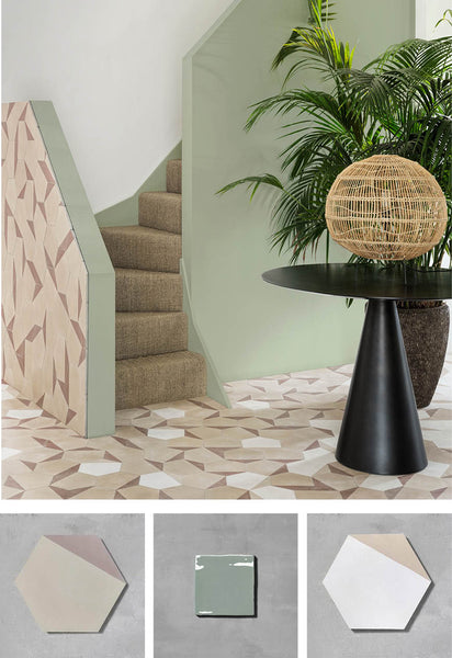
Our Hexagonal Split tiles are a perfect partner to soft sage green
Muted greens are great for creating restful spaces and promoting an air of calm. Beautiful sage tones are as close as green gets to a neutral and will pair with so many colours and looks. Pistachio, too, is a flexible choice that can slot into many schemes in style.
Complement these greens with neutral tones and wicker pieces for a space that’s simple but still infused with colour.

Pretty pistachio is both statement-making and beautifully soft in this bathroom from @maxwellandcompany. Photo by @landers_photos.
Perfect partners: Try these colour combinations to make green really shine

Bright and brave
Go contemporary and fresh, embrace colour and be brave with your choices. Try:
Sweet Yellow or Marigold, Luna Canola or Pistachio Hexagonal
Hint of pink
Chalky, faded and soft, try teals and pinks/orangey tones for a gorgeously warming look. Try: Apricot or Terracotta.