


Case Study: A Beautifully Balanced Victorian Home
By Victoria Smith
Jul 1, 2022
Adding modern touches to traditional homes can be a tricky task. It’s about finding a way to respect the bones of the property while bringing in contemporary design seamlessly - a balancing act that’s anything but straightforward. For interior stylist Katie Rowe, the secret to success when it came to revamping her own home was taking a careful, thoughtful approach, relying on key pieces of furniture and statement tiles to bring old and new together in perfect harmony…
Full name: Katie Rowe
Occupation: Interior Stylist/Content Creator/Owner of Location House
Style and location of your property: Victorian terrace in south-east London
Who lives there: Myself, my husband Charlie who’s a creative director, two kids - Ted and Sophie-May - our dalmatian, Darwin, and a 14-year-old moggy called Paisley.
Have interiors always been a passion? How did you get started in interior styling?
I have always had a passion for the visual arts, and studied History of Art. I’ve had a varied career - from a photographer’s assistant to working agency-side in advertising - then whilst taking a more corporate role organising events, I completed an Open University degree in interior design. Whilst primarily looking after our two young children I have worked freelance as a consultant for private projects, and as a stylist for shoots and festivals.
How would you describe your personal interior style?
Inviting, tactile, and traditional with a mid-century touch.
Your home is beautiful - can you tell us a bit more about it?
We’ve come a long way since those estate agent photos! The house was bought with the full intention to maximise the south-facing garden and the high ceilings and roof line. We were really lucky to have quite a few original features and we have reinstated lots of details such as the ceiling roses and coving.
When we moved into the home in 2013, we initially made some small alterations to the downstairs layout, fixed some underlying issues and stripped the house back to white walls top to bottom to make the space feel more liveable - the lime green wallpaper had to go.
One of our first projects was to revamp the garden which was a concrete death trap! Having two young children really makes certain parts of your home a priority - a safe garden and open-plan living for family dinners and hanging out.
In the last year or so we have revamped the house top to bottom, with a full L-shaped dormer loft and new master bathroom, and complete rejig of the downstairs to create a gorgeous hallway and an open kitchen/diner with doors that lead straight out to the garden.

You’ve used a lot of mid-century furniture in your home. How did you make sure you got the balance right and maintained the property’s Victorian character?
I love the warmth that the wood tones of mid-century furniture bring to a room and wherever we’ve lived the pieces just work. Our house is a late-Victorian terrace, with original fireplaces, coving, large skirting, and ceiling roses. The mid-century style works perfectly in period properties as the pieces balance out the ornate detailing without detracting from the decor and yet when placed in a simple room - like our loft back bedroom - they hold their own and make a great focal point. In this space in particular the teak sideboard softens the harsh lines of the black architectural angled frame and connects the modern space with the rest of the house.
What’s your favourite part of the home?
I would have to say our kitchen/dining room. This space is so light and airy, it’s where we have dinner together as a family, and where we congregate with friends over wine. Having bifold doors that open onto our decking area has made the garden an extension of our living space.
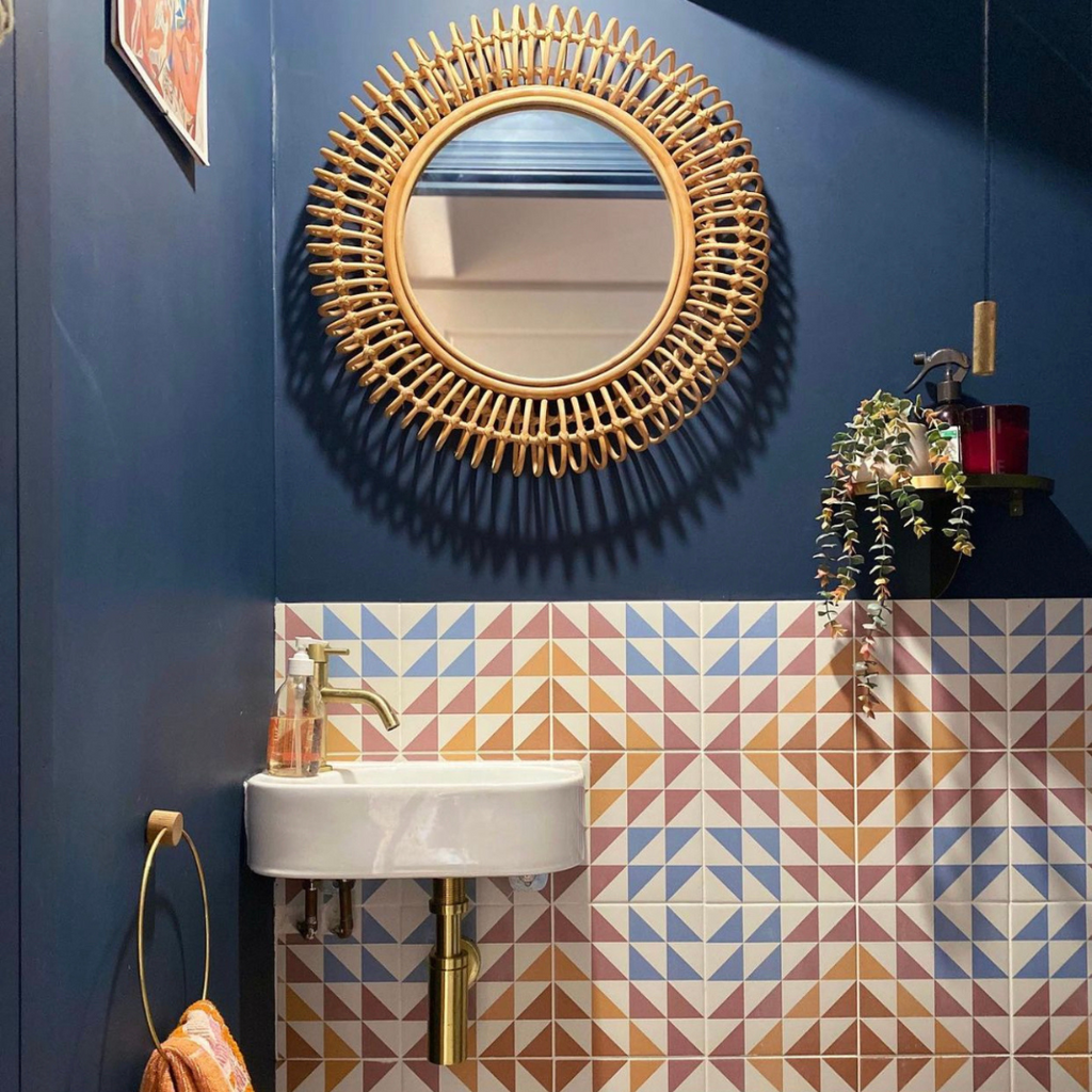
You’ve used our Soho House Berlin tile in the hallway and they looks great! What was your original vision for the space and why was this design such a great fit?
The house originally had a short hallway that stopped at the enclosed staircase. By taking a little of the old dining room we’ve created an open staircase and a more inviting entrance
The Bert & May tiles in the hallway were one of the first things on our wish list. We love the geometric pattern, which gives a nod to mid-century design and works perfectly with our ceiling roses as they have more of an art deco minimalist design. The colours of the tiles are actually very much in keeping with traditional Edwardian hallway tiles, so it’s a slight trickery where they feel suited to the house but help connect the old to the new which is a running theme in our home.

What do you think the tiles add to the space?
The wow factor! We are constantly complimented on our hallway which is really nice as we wanted the entrance to be fairly dramatic and entice people in.
What first led you to use Bert & May?
Bert & May has always been on my radar, and I think these tiles have been on the wish list since they were used in Soho House Berlin. I love the balance of colour and graphic style.
Where do you find your interior inspiration?
I think predominantly it has been from travel, especially on a subconscious level, as there’s always a vibe or feeling you’re trying to evoke in a space. Practically, Instagram and Pinterest are constantly evolving and showing new designs and architectural innovations. There are so many people and brands now that curate and make the most wonderful spaces and homeware.
What’s next - any more exciting projects in the pipeline?
Our master bedroom is next on the list, the only room that didn’t get an overhaul during the renovation! The little pause we’ve had has allowed me to be considered with this room and I’ve started collecting items that will inspire the final design.

Katie’s home is available for location hire via Scouty and Fresh Locations. Follow @therowe on Instagram to see more.